
As an English major and a musician, as well as a Photoshop fanatic, I’ve always placed a priority on making sure whatever I create is as polished and crafted as possible. So it’s been a pretty weird exercise to study AI over the last two years, since I’m basically trying to make decent slop to learn how it works.
Getting over myself when I publish imagery, because I could have done it better in Photoshop, has been a mental challenge. However, I have enjoyed learning the nuances of getting AI to do what I want efficiently, and learning Python along the way is a bonus.
I’ve gone from prompting every cover image by hand in the past to fully automating them. This was because I got carpal tunnel from all the repetitive operations required to publish my newsletter, and I want to focus on reading the headlines and organizing them, and then using what I’ve learned to automate the rest.
My current system uses a Claude skill and Cowork. I describe the theme to the Claude skill, and it outputs a JSON file. I run it through the Gemini API with a single command. The JSON uses Claude Sonnet to build the prompts automatically.
I want to underscore just how little I contribute each week. I explain, like I’m talking to you, the composition of the overall theme and photos.
Like in this week’s case, I wanted the subject to be on the left, with two-thirds of the frame clear on the right, and I wanted to have the tension that comes from the Euphoria title, where you have this girl with glitter, as if she came from a party, and she’s crying, but the title is Euphoria. So that’s a lot of paradoxes, plus the purple, smoky vibe. And then I said, try to create an icon to replace the girl on the left, try to create some sort of context that gives this tension of sadness, and then I hit go.

I dictate the theme to Claude on the phone, while I walk around and think out loud. Literally “phoning it in”. Here’s the actual ‘context dump’ prompt:
This week’s theme centers around an iconic poster image for the HBO show Euphoria. The Euphoria poster shows the character Rue, R-U-E, who is a troubled teen high school student, as a profile on the left side of the image with a tear running down her face and a contrasting star-sparkle hint of makeup on her cheek and around her eyelids. The image is bathed in blue with a little bit of smoke. It’s a sort of Hollywood mysterious feel combined with sadness. That’s probably some sort of aftershock or hangover from bad decisions. The contrast to the title of the show, Euphoria, is a pretty powerful combination.
The Euphoria font, I believe, is Helvetica Neue, all lowercase, pretty skinny. For this week, I wanna take the theme and the atmospheric element of this image and translate it into each of our categories. So we wanna have that party element of the glitter. We definitely want glitter to be in every single one of our posters. We want the contrast of some sort of sadness. It can be a pose, it can be a position. It doesn’t have to be a literal tear, because not all of my categories will include something that could cry. But if it could, like a delivery man crying for Amazon, or it could be a lawyer crying for ethics, it could be a sound engineer crying, I don’t mind that kind of idea, but it doesn’t have to be literal.
And then the category name itself will be in that bold, all-lowercase, Helvetica Neue font. We want that purplish feel. We want the left-hand weight of the object that’s the category icon. We want to think of something that will be that bold icon, like Rue’s face in this picture. What’s going to be that left third of the image that’s dominating, that represents the category? And then, of course, we’re going to leave the right two-thirds or so of the image misty and smoky, and then we’ll overlay the white text on top of it.
The HBO Original does not have to stay, but if, you know, if we want to turn it into some other kind of text, you could, but it doesn’t need to be there. Please confirm that you’re able to see and process this image, because if not, I’m going to get you an AI-generated description that’s more rich than the one I’m providing now. However, if you’re able to see the image and process it, then I won’t have to do that myself.
About four minutes later, I’ve got 60 pictures from Gemini with fairly creative concepts for each of my 60 categories. The script looks at a text file with the category names. It could just as well be Excel with 10,000 categories.
It’s slop, but it’s wild to watch it work.
The idea of taking a gavel and sprinkling glitter on it is not necessarily the most creative thing in the world, but it does the trick, and the proportions are perfect. The lowercase Helvetica Neue font is spot on. The smoke is placed well.

For Amazon, it actually took Zendaya’s character and put her in an Amazon uniform and made her mopey.
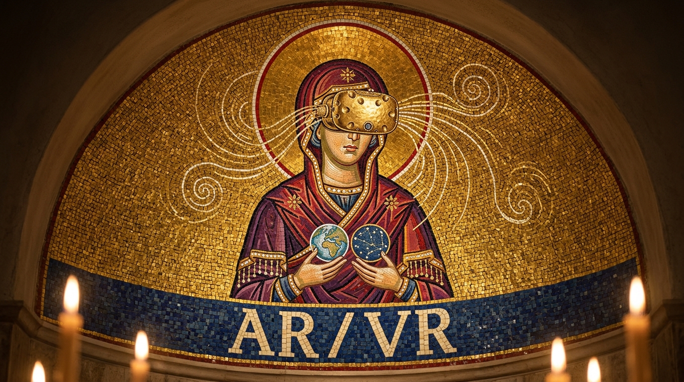
Apple was really creative, and instead of even using the name Apple, Claude swapped it to Forbidden as the title and had a rotten apple with a bite taken out of it. ARVR did the same type of thing and created this kitschy naming convention by misspelling disconnection, which I think was kind of bonkers. Audio is similar to the ends of court, where it just made an object, like the gavel, but in this case it’s a headset.


Benchmarks is actually a fourth-place dusty trophy. Come on, that’s kind of crazy.
ByteDance is nice and recursive because it has a picture of some kids that looks like it could be from Euphoria on an Instagram, with a semblance of a tear on the phone.
I love the subtlety of the Google cover, with simply some eyeglasses with a Google-themed frame. That’s kind of crazy.
Open Claw is killer because it’s like this spooky, sad crane machine in an abandoned arcade with a sad bear inside. That’s fantastic.


The chips and hardware image is pretty basic, but I still like the composition of the computer chip with glitter and the drip on it.
The sad consumer is a little bit basic, but it did the trick, with a neat glow on the face. I like the composition.
Education incorporates Zendaya again, which is pretty great.


I thought the Euphoria theme was pretty relevant to AI this week because Euphoria’s poster itself is derivative of an artist named Petra Collins. So when people say, oh, it’s a Euphoria theme, it’s actually a Petra Collins theme.

I’m keenly aware that these covers are slop, but rather than celebrate the covers, I want to be sure everyone understands I’m not really doing anything, and the computer is building these on its own as a bulk batch. That, plus the fact, I’m not helping what makes it trippy. With an Excel sheet and and API things get very wild.

Leave a Reply